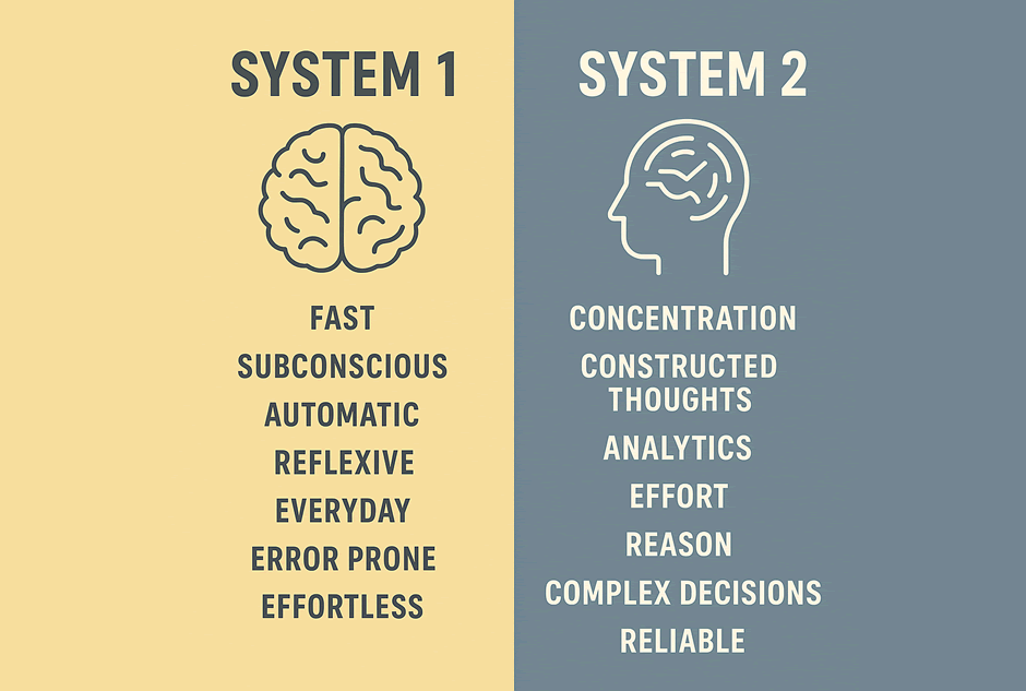
Decisions are a battle between intuition and logic. It’s estimated we make between 2,000 and 10,000 decisions every day. Most of them are near-instantaneous. In his book Thinking, Fast and Slow, psychologist Daniel Kahneman describes two systems of decision-making:
- System 1: fast, automatic, intuitive
- System 2: slow, deliberate, logical [1]
50 Milliseconds. That’s all you get
That’s how quickly someone forms a first impression of your website [2] [3]. So when a user lands on your homepage, your navigation becomes their decision map.
They’ll subconsciously ask:
- “Can I find what I need quickly?”
- “Is this site easy to understand?”
- “Do I want to stay or bail?”
Cluttered navigation forces the brain to work harder. And the harder a brain has to work, the more likely the user is to leave.
When you combine those two systems of thinking, the takeaway is clear.
Web navigation must stay concise to keep users in that fast, intuitive mode of thinking.
The moment you make someone stop and deliberate, you risk losing their attention altogether.
Navigation is often the missing piece
There are many factors that shape a user’s experience: content structure, design, layout, typography, even page speed. But navigation is frequently the most neglected. It’s not uncommon for entire websites to be redesigned while the main menu remains a leftover from years ago. And when navigation is unclear, it can quietly undo the benefits of everything else you’ve improved.
Above the fold is your first test
“the area of a webpage visible before scrolling.”
Your navigation plays a critical role in what users see first. It should act like a trail of breadcrumbs: clear, deliberate, and minimal.
Stop turning navigation into a brain dump
Too often, navigation becomes a stream of someone’s consciousness. A mix of team priorities, old content, and “just in case” links. The result?
- Too many options
- Vague or redundant labels
- Drop-downs that lead nowhere useful
- An undecipherable and unrelated collection of navigation items
In one project, we inherited a navigation where a single top-level item became a catch-all. Everything that didn’t fit elsewhere was dumped into one menu, a digital “miscellaneous drawer.” It confused users, diluted brand messaging, and was completely ineffective.
Tips for brevity in navigation
- Avoid overloading the top-level menu.
There’s no universal number that works for every site. The ideal number of navigation items depends on your layout, including font size, spacing, whether the menu runs full-width, or is split by a central logo or a logo to one side (common on desktop views) that takes up a portion of usable space. The goal is visual and cognitive clarity, not hitting a specific count.
- Use clear, intuitive labels
No jargon. No riddles. Consider shorter alternatives: “about” instead of “about us”, “work” instead of “our work.” Drop pronouns like “our” unless context demands them.
- Group logically
If you must use submenus, keep them organised and minimal.
Do you really need “Home”?
In most cases, the homepage is a starting point, not a destination. If your logo already links back to it, which is now standard, a separate “Home” link in the navigation is often redundant.
More importantly, your homepage shouldn’t contain information that isn’t available elsewhere. If it does, that’s a sign something’s wrong with your structure.
Consider dropping a “Home” link. We’re against it.
Clarity Wins
Your website’s navigation is the first conversation you have with your users. Make it fast, make it clear, and make it count. Every extra decision you force on a visitor increases the chance they’ll go elsewhere or leave them with a lesser impression of your brand, even if they stay.
At Sumobaby, we help businesses simplify the complex. If your navigation feels bloated, confused or just not quite right, we’d love to help you fix it.
Let’s talk.
References
[1] Kahneman, D. (2011). Thinking, Fast and Slow. Farrar, Straus and Giroux.
https://en.wikipedia.org/wiki/Thinking,_Fast_and_Slow
[2] Attention web designers: You have 50 milliseconds to make a good first impression!
https://www.tandfonline.com/doi/abs/10.1080/01449290500330448
